—HTML Series · Post 15: HTML5 Media
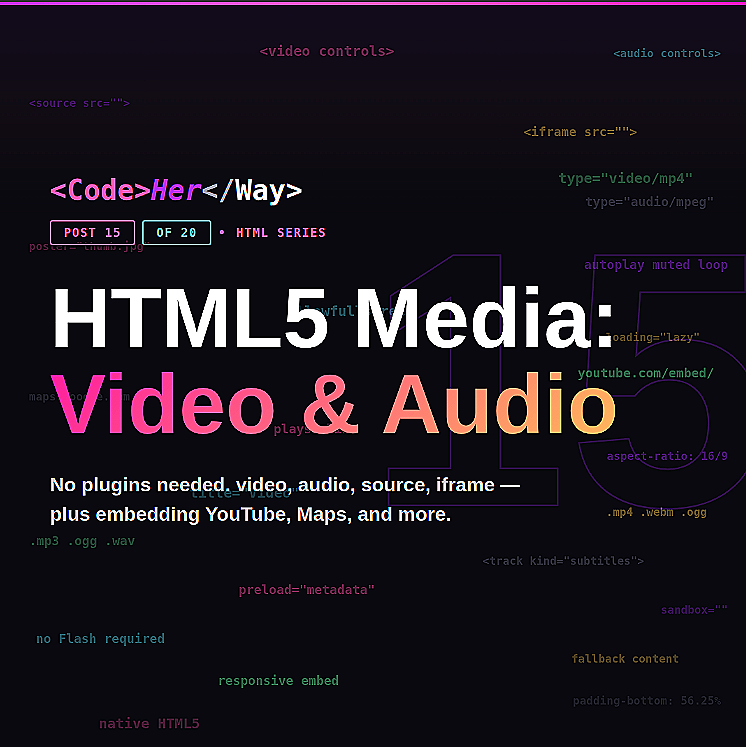
HTML5 Media:
Video, Audio & Embeds
No plugins. No Flash. HTML5 gives you native video, audio, and the ability to embed anything from YouTube to Google Maps — all with a few tags.
There was a time when adding video to a website required Flash Player, three browser plugins, and a prayer. HTML5 changed all of that. Now you can embed video, audio, and content from other sites using native HTML elements — no plugins, no hacks, no dependencies.
This post covers the four media-related elements you need to know: <video>, <audio>, <source>, and <iframe>. Plus how to embed content from YouTube, Google Maps, and other platforms.
The Four Media Elements
<video> — Self-Hosted Video
The <video> element plays video files that you host on your own server or file system. It gives you full control over the player — controls, autoplay behavior, poster images, looping, and more.
Key attributes for <video>:
Modern browsers block autoplay with sound. If you use autoplay, you must also use muted — otherwise the browser silently ignores it. This is a user experience decision by browsers, and it's a good one. Nobody wants a website screaming at them on page load.
Autoplay + muted is perfect for background hero videos. For anything the user should actively watch, use controls instead and let them press play.
Why <source> Matters
Different browsers support different video formats. By providing multiple <source> elements, the browser picks the first format it understands. MP4 has the widest support, but WebM offers better compression. Include both to cover all bases.
The text between the opening and closing <video> tags ("Your browser doesn't support video.") is the fallback content — it only shows if the browser doesn't support the video element at all. Extremely rare today, but good practice.
<audio> — Self-Hosted Audio
The <audio> element works almost identically to <video> — same pattern, same <source> fallbacks, same attributes. The difference is that it renders as a compact audio player bar instead of a video rectangle.
Self-host (using <video> and <audio>) when you need full control over the player, the files are small, or you're building something like a background video or sound effect. Embed (using <iframe>) when the content lives on another platform — YouTube, Spotify, SoundCloud. Embedding offloads bandwidth and gives you the platform's player for free.
<iframe> — Embedding External Content
The <iframe> (inline frame) is how you embed content from other websites into your page. It creates a window into another site — YouTube videos, Google Maps, CodePen demos, Spotify players, Calendly widgets — all running inside your page.
Embedding YouTube
YouTube gives you an embed code. On any video, click Share → Embed, and it hands you an iframe. Here's what it looks like:
Embedding Google Maps
Embedding Other Sites
The pattern is always the same — the platform gives you an embed URL, and you put it in an <iframe>. CodePen demos, Spotify playlists, Figma files, Calendly scheduling widgets — they all work this way. Just look for the "Embed" or "Share" option on the platform.
The title attribute on iframes is important for accessibility. Screen readers announce it so users know what the embedded content is without seeing it. Don't leave it blank — describe what's embedded: "CodeHerWay intro video", "Office location map", "Spotify podcast player."
Making Embeds Responsive
By default, iframes have fixed pixel dimensions — they don't resize with the screen. On mobile, a 560px-wide YouTube embed overflows the viewport. Here's the modern CSS fix:
If you're using modern CSS, you can skip the padding hack and use aspect-ratio: 16/9 directly on the iframe. It's cleaner, but check browser support for your audience. The padding-bottom trick works everywhere.
iframe Security — What to Know
Iframes load an entire external webpage inside your page. That comes with security considerations. Never embed untrusted content, and use these attributes to lock things down:
Think of an iframe like inviting someone else's website into your living room. If it's YouTube, Google Maps, or CodePen — trusted platforms — you're fine. But you wouldn't embed a random URL you found on the internet. Only embed content from sources you trust, and use loading="lazy" on anything below the fold to keep your page fast.
I once added a YouTube embed to my portfolio and shipped it with autoplay enabled. On the YouTube embed URL. I didn't realize it was there because I copied the embed code from somewhere else without reading it.
So every time someone opened my portfolio, a tutorial video started blaring out of their speakers. A recruiter emailed me to say "cool portfolio, but the screaming video scared my cat."
I removed autoplay that same minute. Always read the embed code before you paste it. 🐱
🔨 Mini Build: Media Gallery Page
Create a media gallery page that uses all four media elements:
The Bottom Line
<video> and <audio> give you native media players — no plugins required. <source> provides format fallbacks so every browser finds something it can play. And <iframe> lets you embed content from any platform that supports it — YouTube, Maps, CodePen, Spotify, and beyond.
Use controls for anything users should actively play. Use muted autoplay loop for background visuals. Always add a title to iframes for accessibility. And make your embeds responsive so they don't break on mobile.
Media makes your sites feel alive. Now you know how to add it properly.